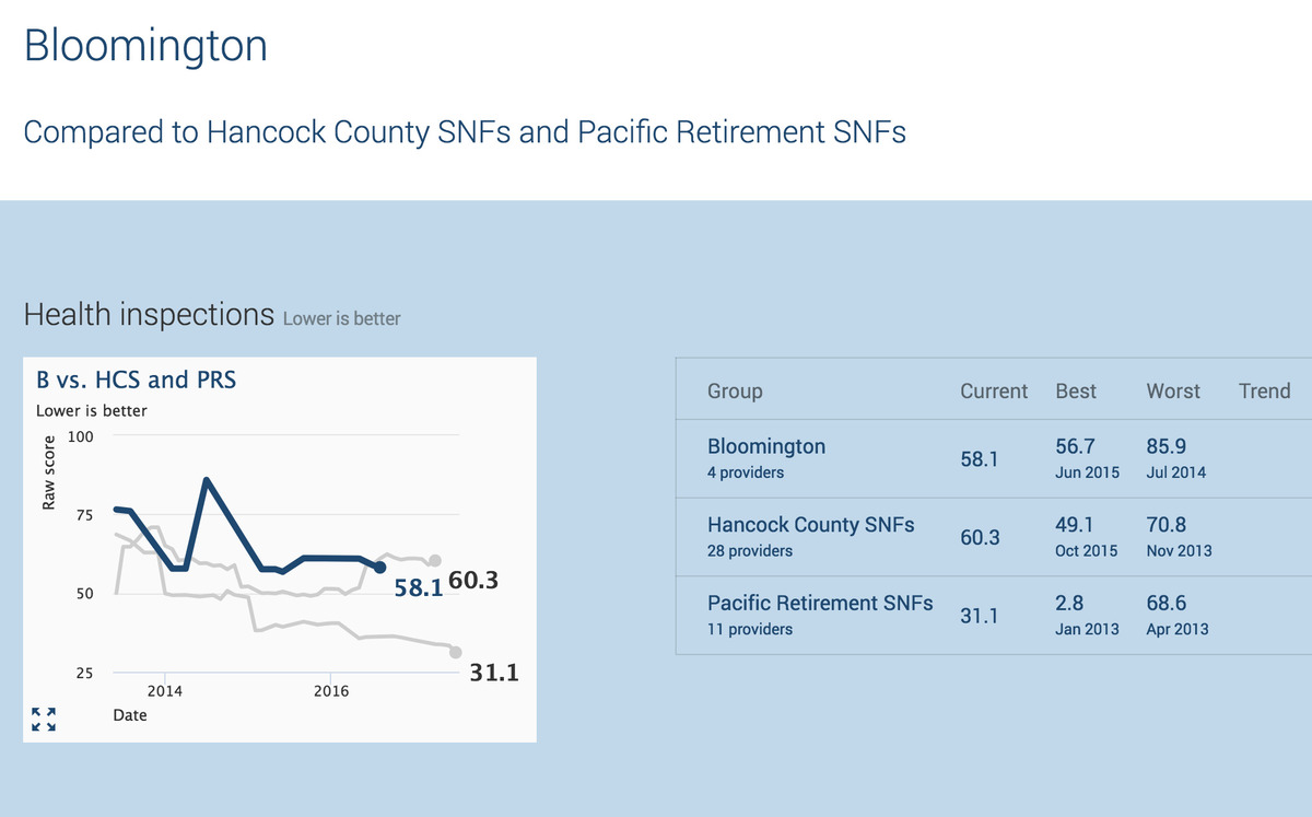
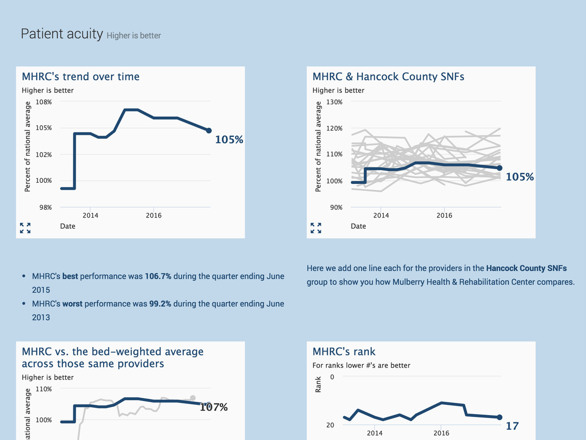
Responsible for just one building? We can show how you compare to your nearest competitors. If you're part of a chain, we can also compare how you're doing relative to the rest of the facilities in your group.
When plotting a facility against a group, we show the individual performance of each member of the group. You can view outliers as well as general performance trends.
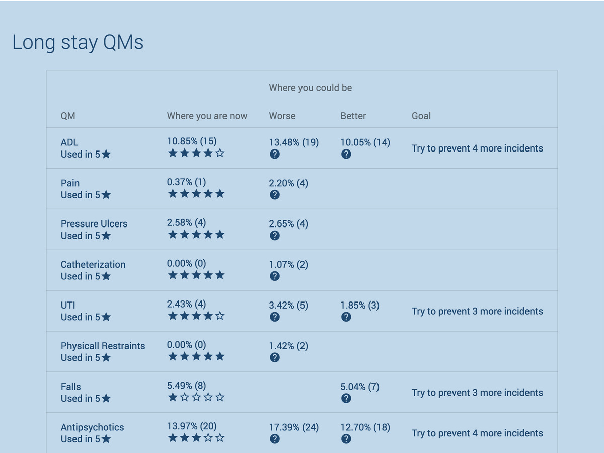
In the tabular comparison reports, we show the rate of incidence for each Quality Metric and translate it into a count of residents affected. We show that data versus the state average for the facility as well as any group you choose. We make it easy to see where you're doing better (or worse) than the groups you're comparing yourself to.
Each analysis has great potential for growing your presence. Share insights with discharge planners, ACO representatives, physicians, your staff, & potential residents.